
This is a followup from my older blog post “Integrate Oracle JET into Apex 5“.
Oracle JET Diagrams are a new data visualization type in Oracle JET 2.1.0.
This post is organized into three mostly independent parts
- How to setup Oracle JET v2.2.0 for usage in Apex
- How to copy Oracle JET Container Diagrams from the cookbook into Apex
- Using Oracle JET Diagrams with container layout
How to setup Oracle JET v2.2.0 for usage in Apex
Step 1) Download the base distribution
From the download page (http://www.oracle.com/technetwork/developer-tools/jet/downloads/index.html) choose the base distribution and download this zip file.
Step 2) Unzip JET into the APEX image folder
Copy and unzip the file into a folder insider your image path from apex.Where you put it is your own choice. I prefere to add it to the library path where oracle jet will also be in Apex 5.1 distribution (/libraries/oraclejet/2.0.2)
You can choose a very similar path “/libraries/oraclejet/2.2.0”. Create this path and unzip the file there.
The next time apex is upgraded remember not to move the image folder but simply to overwrite it (make a copy of the original before that).
Step 3) Create, manipulate and deploy the main.js file
Basis for this should always be the main-template.js file from the subfolder \js\libs\oj\v2.2.0. This template has all the correct paths and versions for all sub modules that are included in the main.js.
Additionally we can add a base-url that points to the folder where we unziped JET. If we add the main.js file in the js folder, then this is not needed. But we come back to that base-url later. So for JET version 2.2.0 the complete main.js file will look like this.
/**
* Example of Require.js boostrap javascript
*/

requirejs.config({
// Path mappings for the logical module names
paths: {
'knockout': 'libs/knockout/knockout-3.4.0',
'jquery': 'libs/jquery/jquery-3.1.0.min',
'jqueryui-amd': 'libs/jquery/jqueryui-amd-1.12.0.min',
'ojs': 'libs/oj/v2.2.0/min',
'ojL10n': 'libs/oj/v2.2.0/ojL10n',
'ojtranslations': 'libs/oj/v2.2.0/resources',
'text': 'libs/require/text',
'promise': 'libs/es6-promise/es6-promise.min',
'hammerjs': 'libs/hammer/hammer-2.0.8.min',
'signals': 'libs/js-signals/signals.min',
'ojdnd': 'libs/dnd-polyfill/dnd-polyfill-1.0.0.min',
'css': 'libs/require-css/css.min',
'customElements': 'libs/webcomponents/CustomElements.min',
'proj4': 'libs/proj4js/dist/proj4'
},
// Shim configurations for modules that do not expose AMD
shim: {
'jquery': {
exports: ['jQuery', '$']
}
},

// This section configures the i18n plugin. It is merging the Oracle JET built-in translation
// resources with a custom translation file.
// Any resource file added, must be placed under a directory named "nls". You can use a path mapping or you can define
// a path that is relative to the location of this main.js file.
config: {
ojL10n: {
merge: {
//'ojtranslations/nls/ojtranslations': 'resources/nls/myTranslations'
}
},
text: {
// Override for the requirejs text plugin XHR call for loading text resources on CORS configured servers
useXhr: function (url, protocol, hostname, port) {
// Override function for determining if XHR should be used.
// url: the URL being requested
// protocol: protocol of page text.js is running on
// hostname: hostname of page text.js is running on
// port: port of page text.js is running on
// Use protocol, hostname, and port to compare against the url being requested.
// Return true or false. true means "use xhr", false means "fetch the .js version of this resource".
return true;
}
}
}
});

/**
* A top-level require call executed by the Application.
* Although 'ojcore' and 'knockout' would be loaded in any case (they are specified as dependencies
* by the modules themselves), we are listing them explicitly to get the references to the 'oj' and 'ko'
* objects in the callback.
*
* For a listing of which JET component modules are required for each component, see the specific component
* demo pages in the JET cookbook.
*/
require(['ojs/ojcore', 'knockout', 'jquery', 'ojs/ojknockout', 'ojs/ojbutton', 'ojs/ojtoolbar','ojs/ojmenu'], // add additional JET component modules as needed
function(oj, ko, $) // this callback gets executed when all required modules are loaded
{
// add any startup code that you want here
}
);
Step 4) Reference the main.js file in the page template
How to copy Oracle JET Container Diagrams from the cookbook into Apex
The JET cookbook demo can be found here. The interactivity in this visualization is charming. We can organize nodes into containers and expand or decrease the container.
Step 1) Copy the html and the js code from the cookbook to our page
Step 2) Add the require.config call
This time we add a base URL.
requirejs.config({
  baseUrl: '#IMAGE_PREFIX#libraries/oraclejet/js',
  // Path mappings for the logical module names
  paths: {
    'knockout': 'libs/knockout/knockout-3.4.0',
    'jquery': 'libs/jquery/jquery-3.1.0.min',
    'jqueryui-amd': 'libs/jquery/jqueryui-amd-1.12.0.min',
    'ojs': 'libs/oj/v2.2.0/min',
    'ojL10n': 'libs/oj/v2.2.0/ojL10n',
    'ojtranslations': 'libs/oj/v2.2.0/resources',
    'text': 'libs/require/text',
    'promise': 'libs/es6-promise/es6-promise.min',
    'hammerjs': 'libs/hammer/hammer-2.0.8.min',
    'signals': 'libs/js-signals/signals.min',
    'ojdnd': 'libs/dnd-polyfill/dnd-polyfill-1.0.0.min',
    'css': 'libs/require-css/css.min',
    'customElements': 'libs/webcomponents/CustomElements.min',
    'proj4': 'libs/proj4js/dist/proj4'
  },
  // Shim configurations for modules that do not expose AMD
  shim: {
    'jquery': {
      exports: ['jQuery', '$']
     }
    },

// This section configures the i18n plugin. It is merging the Oracle JET built-in translation
// resources with a custom translation file.
// Any resource file added, must be placed under a directory named "nls". You can use a path mapping or you can define
// a path that is relative to the location of this main.js file.
    config: {
        ojL10n: {
            merge: {
                //'ojtranslations/nls/ojtranslations': 'resources/nls/myTranslations'
            }
        }
    }
});
Step 3) Find out why it is not working yet
The only remaining ressource that could not be loaded should be the diagramLayouts/DemoContainerLayout.js file. The reason is simple. This file is not included in the base zip file. However we can get it directly from the JET cookbook page.
First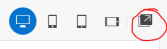 we open the cookbook in standalone mode. There is a button in the upper right corner that helps us to do so.
Then we inspect the network files again and locate the DemoContainerLayout.js. We can simply copy the address and store the file to our system

Step 4) Copy and integrate the layout file
To integrate this layoutfile into our page I choose a slightly different approach. This is not a file that might be relevant for a default Oracle JET installation. Instead I’d like to add it specifically to my application. In this way I can modify the file and influence the behaviour of my diagram without changing anything for other applications.
So we upload it as a static application file (in my case with a directory “oraclejet”).
And we reference the file directly in the require call. Here the suffix “.js” is important. It tells require that this is a direct file reference and not an alias name for a previously defined ressource.
require([‘ojs/ojcore’, ‘knockout’, ‘jquery’, ‘#APP_IMAGES#oraclejet/DemoContainerLayout.js‘,
‘ojs/ojknockout’, ‘ojs/ojbutton’, ‘ojs/ojdiagram’], function(oj, ko, $, layout) { …
Using Oracle JET Diagrams with container layout
An OracleJet diagram is essentially a graph. It consists of nodes and links between the nodes. The container diagram has the additional posibility to organize nodes into a hierarchy. Other layouts have similar possibilities but choose to render it completly different.
Which layout to use is configured in the attributes of the ojDiagram component (View) and inside the javascript Model.

The container layout has only very limited drawing possibility. Nodes are rectangles and links are lines.
The main nodes (containers) are always drawn horizontically from left to right. Child nodes are always drawn vertically from top to bottom and inside their parent container. All nodes that have child nodes are considered containers and can potentially be expanded or collapsed.
Links that connect nodes that are side by side are attached to the left or right side of the nodes. Links that connect nodes that are above or below each other connect to the top and bottom part of a node.
This very simple drawing approach allows for some nice small visualizations. For example we can easily present process flows with that. If we want to draw huge networks, then another layout will be more appropriate.
How to change descriptions
Nodes have several properties that can be set. A complete list can be found in the ojDiagram doc.
- id ==> will uniquely identify a node. It will also be used as StartNode and EndNode in the link properties.
- label ==> the text that is printed inside the node.
- shortDesc ==> a small description that is shown as a tooltip when hovering over a node
The cookbook uses a small function to simplify node creation. But we can also create a node using direct json syntax.
this.nodes.push({
id: "id",
label: "label",
shortDesc: "shortDesc",
nodes: null
});
How to color the nodes
All nodes have a default style. The default is a kind of greyish background. We can change the backgroundStyle property for our node.
this.nodes[0].nodes[0].nodes[0].backgroundStyle = 'height:20px;width:60px;
border-color:#444444;background-color:#00FF80;border-width:.5px;
border-radius:8px';
This colors the first child of the first child in the first container to green and rounds the corners.
We can also simply set the background color, without setting all the other properties. For example for the second child in the first container.
this.nodes[0].nodes[1].backgroundStyle = "background-color:red";
It is possible to add images or shapes to our diagram. We can position them in the middle, left or right inside a node. This line will put a small yellow “human” in node N1.
this.nodes[1].icon = {width: 10, height: 10, halign: "right",
shape: "human", color:"yellow", borderColor:"grey"};
The following shapes are predefined.
square, plus, diamond, triangleUp, triangleDown,
human, rectangle, star, circle
It is possible to create custom shapes by providing an SVG path. Or we can add images instead of a shape. However this post is to small to explain that in more detail.
Next I show how to create a custom gradiant fill. There are two steps to do so.
First create the SVG-Fill-Gradient
<svg height="0" width="0">
    <defs>
      <linearGradient id="gradient" x1="0%" y1="100%">
        <stop offset="0%" style="stop-color: #66ccff"></stop>
        <stop offset="80%" style="stop-color: #0000FF"></stop>
      </linearGradient>
    </defs>
  </svg>
then add this gradient to the node.
this.nodes[0].containerStyle = {fill: "url(#gradient)"};
And the combined result looks like this. It certainly is not pretty, but it shows what is possible using a little imagination.

Further readings: JET custom shapes and image markers
The source code for this coloring example can be copied into the JET cookbook page.
The HTML part
<div id='diagram-container>
<svg height="0" width="0">
<defs>
			<linearGradient id="gradient" x1="0%" y1="100%">
<stop offset="0%" style="stop-color: #66ccff">;</stop>
<stop offset="80%" style="stop-color: #0000FF"></stop>
</linearGradient>
</defs>
</svg>
<div id="diagram" data-bind="ojComponent: {
component: 'ojDiagram',
layout: layoutFunc,
animationOnDataChange: 'auto',
animationOnDisplay: 'auto',
maxZoom:2.0,
selectionMode: 'single',
styleDefaults : styleDefaults,
nodes : nodes,
links : links,
expanded: expanded
}"
style="max-width:800px;width:100%; height:600px;"></div>
</div>
The javascript part
require(['ojs/ojcore', 'knockout', 'jquery', 'diagramLayouts/DemoContainerLayout',
'ojs/ojknockout', 'ojs/ojbutton', 'ojs/ojdiagram'], function(oj, ko, $, layout) {
function model(data) {
var self = this;
self.layoutFunc = layout.containerLayout;
function createNode(id, nodes) {
return {
id: id,
label: id,
shortDesc: "Node " + id,
nodes: nodes ? nodes : null
};
}
function createLink(id, startId, endId) {
return {
id: id,
startNode: startId,
endNode: endId,
shortDesc: "Link " + id + ", connects " + startId + " to " + endId
};
}
this.expanded = ['N0', 'N00'];
this.nodes = [], this.links = [];
var childNodesN00 = [createNode("N000"), createNode("N001")];
var childNodesN0 = [createNode("N00", childNodesN00), createNode("N01"), createNode("N02")];
var childNodesN2 = [createNode("N20"), createNode("N21"), createNode("N22")];
this.nodes.push(createNode("N0", childNodesN0));
this.nodes.push(createNode("N1"));
this.nodes.push(createNode("N2", childNodesN2));
this.nodes.push(createNode("N3"));

this.nodes[0].nodes[0].nodes[0].backgroundStyle = 'height:20px;width:60px;border-color:#444444;background-color:#00FF80;border-width:.5px;border-radius:8px';
this.nodes[0].nodes[1].backgroundStyle = "background-color:red";
this.nodes[1].icon = {width: 10, height: 10, halign: "right", shape: "human", color:"yellow", borderColor:"grey"};
this.nodes[0].containerStyle = {fill: "url(#gradient)"};

// disable selection on some containers
this.nodes[0].selectable = 'off';
this.nodes[0].nodes[0].selectable = 'off';

// create the links
this.links.push(createLink("L0", "N2", "N3"));
this.links.push(createLink("L1", "N1", "N21"));
this.links.push(createLink("L2", "N1", "N22"));
this.links.push(createLink("L3", "N000", "N1"));
this.links.push(createLink("L4", "N001", "N1"));
this.links.push(createLink("L5", "N02", "N1"));
this.links.push(createLink("L6", "N000", "N001"));

this.styleDefaults = {
nodeDefaults: {
containerStyle: "border-color:#abb3ba;background-color:#f9f9f9;border-width:.5px;border-radius:1px;padding-top:20px;padding-left:10px;padding-bottom:10px;padding-right:10px;",
labelStyle: "color:#252525;font-size:8px;font-family:'Helvetica Neue', Helvetica, Arial, sans-serif;font-weight:normal;font-style:italic",
backgroundStyle: 'height:20px;width:60px;border-color:#444444;background-color:#f9f9f9;border-width:.5px;border-radius:1px',
icon: null
},
linkDefaults: {startConnectorType: "circle", endConnectorType: "arrow"}
};
}
$(document).ready(
function() {
ko.applyBindings(new model(),
document.getElementById('diagram-container'));
}
);
});
How to modify links
Modifing links is very similiar to modifing nodes.One main difference however is the definition of the “arrows” on each side of the link. Usually we want to have all links look the same. So instead of changing the properties of each single link, we just switch the default behaviour.
The following line will make the links look like simple arrows.
linkDefaults: {startConnectorType: "none", endConnectorType: "arrow"}
Also for static diagrams I prefer to give each link a proper description (shortDesc).
How to add interactivity
Back to our apex application.The goal here is to click on a node (or a link) and to show a specific Apex region that corresponds with the selection.
First we allow to select a node. The diagram layout can do “single” or “multiple” selections. To allow this, we add the selectionMode: ‘single’ property to our view. And since we want to work with the selected parts later, we also add selection: selectedNodes.
This selectedNodes needs to be defined in the nodeProperty.
Then we prepare our apex page and put some “apex connector logic” in place.
We create a region for each node that we want to interact with.
The region gets a static id R_DETAILS_XXX where XXX is the ID of the node and it gets a custom attribute
style="display: none;"
As a result we know the ID of each region and the region will be rendered but not displayed. With that we add a small function showDetails to the page. It will show one region and hide another (the previous) one.
function showDetails(showNodes,hideNodes) {
 console.log("ShowDetails="+showNodes);
 if (hideNodes!==""){
 $("#R_DETAILS_"+hideNodes).hide();
 };

$("#R_DETAILS_"+showNodes).show();

}
The JET and knockout binding will then be done using the optionChange property.
We add a function to react on the change of a selection. The “value” and the “previousValue” will then hold the ID of the node (or link). If we chose to do multiple selections it can be an array of nodes.
Html
<div id="diagram" data-bind="ojComponent: {
component: 'ojDiagram',
layout: layoutFunc,
selection: selectedNodes,
selectionMode: 'single',
styleDefaults : styleDefaults,
nodes : nodes,
links : links,
optionChange: diagramOptionChange
}"
style="max-width:800px;width:100%; height:600px;"></div>
Javascript
// set default selection

this.selectedNodes = ['N000'];

// disable selection on some containers
 this.nodes[0].selectable = 'off';
 this.nodes[0].nodes[0].selectable = 'off';

self.diagramOptionChange = function (event, data) {
 console.log("optionchanged="+data.option);
 if (data['option'] == 'selection') {
   showDetails(data['value'], data['previousValue']);
 }};
Further reading:
Data vizualization blog: A guide to diagrams (part9)
 svenweller